Effective Cartography
Mapping Census Data
It is easy to make colorful maps with quantitative data. It is more complicated to make a map that is a useful tool for understanding the way that data describes a place and the things and conditions that were observed. It is all to common to see maps made with GIS that reveal that tne map-maker, though he or she has learned how to make a map, has nevertheless misunderstood how to make sense out of the data. This topic is discussed in more detail on the page, Mapping with Quantitative Data which is required reading for this tutorial, which only covers the nuts and bolts of the subject.
References:
- Elements of Cartographic Style
- Mapping with Quantitative Data
- Understanding and Obtaining Census Data
- Example Maps
Download and Explore The Tutorial Dataset
Download the tutorial dataset and unpack it to a new directory on your local hard drive. The dataset includes data and metadata from various sources. It is all organized according to the Primer on Organizing Data and Metadata with Arcgis. If you open the file gis_docs\greenline_ext.mxd you will see that a nice graphical hierarchy has been created for our study of Somerville. following the tutorial Nuts and Bolts of Mapping The idea behind this framework is to provide labels for the major political and physical elements that tie our area of interest together with its regional context.
Understand the Elements of Census Data
Use your file system browser to look at the files in the folder sources/census_tiger_2013. Use the ArcMap Add Data button to find the tabblock2010_25_pophu_extract.shp feature class and and add this to ArcMap. We will refer to this as our Blocks shape file. This shape file came from the Census Bureau's TIGER Download site.
Mapping Density
In class, we will begin by making a map of population per census block. After exploring the problems of comparing the population of blocks of different sizes, we will then add a Hectares or Acres column to our table and will use this to Normalize the data. Normalization factors out the area of each block, allowing us to compare their population density on equal terms.
References
- Metadata for the 2010 Blosk Level data
- Mapping Quantitative Statistics
- How to symbolize quantitative data
- Adding and deleting fields
- Calculating Area of Polygons
Create a Normalized Block Density Map
- Open the attribute table for your blocks shape file and inspect the attributes.
- Add a new field to your table. Make it a Double type. Which is a numeric type that can have decimal places. Name this field "Hectares" or "Acres" depending on your preference..
- Right-click the heading of your new column and choose Calculate Geometry and fill in the blanks appropriately.
- Now open the symbology properties of your new layer and choose to map your blocks by Quantities > Graduated Colors
- Choose Pop_10 (2010 Population) and Normalize by your area field.
Adjust the Numerical Category Breaks
The automatically generated classification created by ArcMap may be a good starting place for categorizing your data, but the crazy numbers that result for the class divisions do not make for easy reading. Use the Classification options in the symbology properties to create new class breaks that help your users to see the blocks with extremely low and extremely high population density and a few grades to show blocks of average, above average and below average density. Adjust your legend headings and titles so that they are easy for a human being to understand.
What is the Block with Highest Density Within the Map Extent
The final stage of figuring out your class-breaks would be to figure out what the very top value should be. Keep in mind that our census blocks layer covers much more than our study area. One way of doing this would be to create a new shape file by exporting the blocks within the current map extent before creating your classification. This is easy, but inpractice it is not the best, since you may want to change the map extent later. The best way to explore the dentisites within the map is to create a new field in your attribute table for for Population Density and calculate the values. Then, you can use the Select tool to select the blocks within the map, and sort by Density.
References:
- Making simple field Calculations Note: it is not necessary to start an edit session when you do this.
- Selecting Features Interactively ArcGis 10.6 Web Help.
- Viewing the Selected Features in the Attribute Table
- Sorting Records ina Table by One Field
Exploring the American Community Survey
As we explain in more detail on the page About Census Data the American Community Survey (ACS) uses a very complicated sampling method to collect lots of very specific information on households. This sampling method leads to large margins of error depending on which statistic you are looking at. Our sample data set includes a geodatabase from the ACS Five Year Estimates, downloaded from the Census Bureau's TIGER Download site. This feature class can be found in the sources/census_tiger folder. The 2009-2014 ACS 5 year summary geodatabase for Massachusetts may be found in the Sources\census_tiger folder.
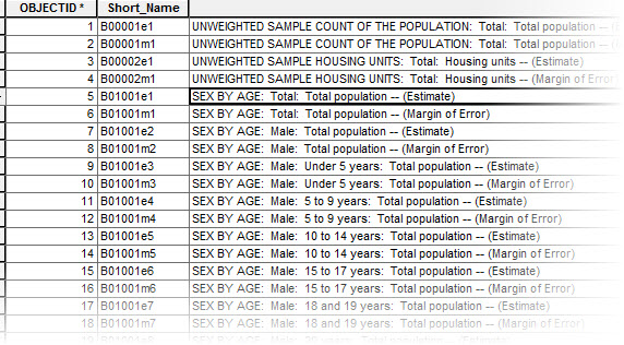
The geodatabase is named ACS_2013_5YR_BG_25.gdb. The easiest way to explore this geodatabase is by going into it with the Add Data tool in ArcMap. Inside, you wil find a polygon feature class (block groups) and several auxiliary tables wose names begin with the letter X. You wil alsofind a table named BG_METADATA_2013. Add that metadata table and open it in ArcMap. Notice that the first two rows inthe table look like this:
	B00001e1	UNWEIGHTED SAMPLE COUNT OF THE POPULATION:  Total:  Total population -- (Estimate)
	B00001m1	UNWEIGHTED SAMPLE COUNT OF THE POPULATION:  Total:  Total population -- (Margin of Error)
The 11,000 rows inthe BG_METADATA_2013 table refer to the demographic counts (i.e. fields, or columns) that are ncluded in the manytables of the ACS Geodatabase. This is more columns that you would want to have in a single table.
Understanding the Demographic Tables and Columns in the ACS
Again, referring to the first tworows in the BG_METADATA_2013 table, The value of the first column, B00001e1 is a refers to the name pf a column in the geodatabase table X00_Counts. If you open up that table, you wil see how the rows in BG_METADATA refer to column names in the demographic table. You may be wondering how I knew to look at teh X00_Counts. The secret is that if the colum name begis with B02, then the name of the table you want begin with X02. Why? I don't know!
IN the table, X00_Counts the values for the fields B00001e1 and B00001m1 refer to the actual number of people sampled in each block group. This is interesting for understanding how many people in each block group were actually sampled for the American Community Survey.
Population and Age Estimates
If we want to know the estimated Population for each Block Group based on the survey, we need to look at the next bunch of rows. Rows 5 through 102 in the BG_Metadata_2013 table provide the Short Name and Full Name of the Columns for the geodatabase table X01_AGE_AND_SEX.
Examine these column names and descriptions and you will discover that they refer to a sequence of estimated counts for males and females, broken down by fairly fine age categories. The first column referenced, B01001e1 SEX BY AGE: Total: Total population -- (Estimate) is what is known as the Universe for the columns relating to age and sex. Another way of saying this is that we opened the table X01_AGE_AND_SEX, and summed up the estimated counts for all of the age categories for Males and for Females, we should come up with the same number that is referenced in the column, B01001e1. The Margins of Error are important because these are not actual counts, but estimates based on a fairly small sample size. This fact is something you should keep in mind when discussing maps created with the American Community Survey
More ACS Tables and Columns
There are so many tables of demographic statistics covered in the ACS that it can be a daunting task to figure out what statistics are available to you, and where to find them. One way to begin discovering data that you want, is to explore the ACS Subject Guide at the Census Web site. For example, you might be interested Housing Occupancy / Vacancy Status You could click on this link on the Subject Guide, and it will bring you to a list of tables and columns, that provide you with very detailed breakdown of the data counts related to Vacancy Status. Looking at the IDs for the columns in this subject guide will help you to find the tables and columns from the Geodatabase as illustrated below.
It is a bit aggravating that the Subject finder does not tell you the names of the actual columns in each table. To see this level of metadata, you need to look at the BG_METADATA_2013 discussed a couple of paragraphs above. Then you can open the associated geodatabse table, X25_Housing Characteristics to access the actual data counts for each block group.
Mapping with the ACS
Calculating Land Area for Block Groups
Block groups can be substantially covered by water. To see this just look at the blockgroups that border the Charles River and the Boston Harbor. To calculate population density on these blockgroups you should not use the Calculate Geometry function as we did above with the Block data. Fortunately, the blockgroup feature class that we obtained with the ACS has an attribute called aland. The metadata explains that this is the Land Area for each block group. The metadata does not say what the units are! But I'll tell you that the units are Meters.
Creating a Hectares Field in your ACS Blockgroups layer
If you want to make a population density map with your American Community Survey blockgroups you will find that the values in the Land Area column are expressed in Meters. This wil make your Population Density numbers very awkward to think about and discuss. In the highest density areas the units are 0.8 people per square Meter. If you try to visualize 0.8 people per meter it is very difficult to picture. To fix this, you ought to create a new column to hold a value for Hectares, and then calculate its values as Meters / 10000. If you know that a Hectare is 100x100 meters or about the size of two football fields, then it is easy to visualize 800 people per Hectare. It is much better to express density figures in terms of Hectares or Acres, which are much easier to visualize than Population per Square Meter or Population per Square Kilometer.
Resist the temptation to use the Calculate Geometry tool to calculate the area of your blockgroups as discussed above, because many blockgroups have subsantial portions of their area covered by water. Look at the Charles River for example. This is why we want to use the ordinary Calculate Field Values technique to calculate Hectares as AreaLand / 10,000 which is the number of square meters in a Hectare.References
- Adding and deleting fields
- Calculating area, length, and other geometric properties Don;t bother to start an edit session.
Creating a Hectares Column and Calculating its Values
- Note: you should do this calculation before you join your shapefile to any of the demographic tables.
- Open the attribute table for the ACS_2013_5YR_BG_25_MASSACHUSETTS feature class.
- Use the Table menu to Add a field. Name it Hectares and make its type Double . A Double-Precision data type allows you to represent any number with decimal places as needed.
- Right-Click the column heading of your new Hectares field and choose Field Calculator
- In the Field Calculator dialog, double click the field name for ALAND so that its name appears in the expression panel at the bottom of the field calculator. Then use the keypad to complete the expression so that it looks like this: [ALAND] / 10000. And click OK.
- Note that if you have any rows in your table selected when you run the Filed Calculator only selected rows wil lbe updated. To make sure that this is not happening, you can check the bottom left of the Tables window to see if any records are selected. If they are you can use Selection > Clear Selected Features and run the calculation again.
- Note 2: Adding and calculating this hectares column should be done before you join the demographic data table to your feature class. This join technique is covered below.
Joining the Block Group Polygons with the Demographic ACS Tables
The ACS blockgroups feature class can be joined to any of the auxilliary tables by linking the field GEOID_DATA in feature attribute table with the Field GEOID in any of the other tables. For our example we will join the blockgroups feature class with the table X01_AGE_AND_SEX. This will allow us to make a population density map.
References
Doing the Join
- Right click on your blockgroups layer, ACS_2013_5YR_BG_25_MASSACHUSETTS and choose Copy
- Make a copy of this layer by now clicking on the data frame, Layers, and picking Paste Layers.
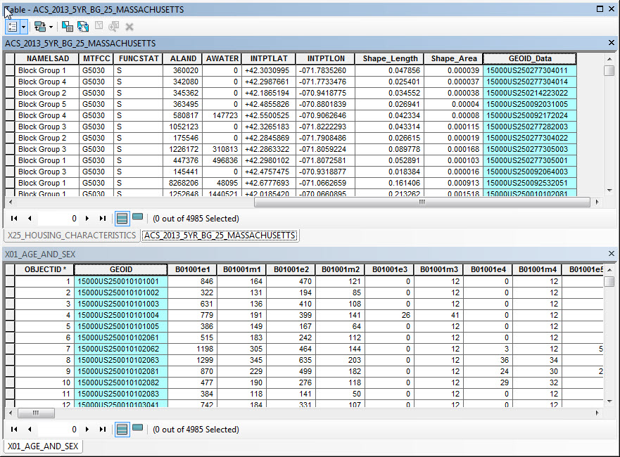
- Inspect the attribute table of your new layer and also the table X01_AGE_AND_SEX from your ACS Geodatabase. Notice that each contains a field named GeoID but these columns obviously don't reference eachother. To join these two tables, we will need to match the Field GEOID_DATA in the blockgroup attribute table to join with the GEOID field in the demographic table. Click here for a screenshot.
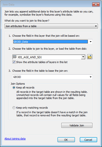
- Now right-click your new layer and choose Joins and Relates -> Join...
- To join the ACS polygons with the demographic tables you use the Field GEOID_DATA in the blockgroup attribute table to join with the GEOID field in the demographic table. Click here for a screenshot of the join dialog.
- Inspect the attribute table of your new layer now to see that it now has lots and lots of columns!
You are now ready to make a population density map with your block-group data! Now that you have your blockgroup polygons with a Hectares column and you have joined the polygons to a table of demographic estimates the procedure is the same as we worked through with blocks, except for the column we will use for Total Population should be B01001e1
More Mapping the Big Tables of the ACS
Our first population density map with the ACS described above has covered some important aspects of mapping with the ACS. So now we know how to calcualet the dry hectares of blockgroups (or tracts) for normalizing density. We know how to find data-columns from the demographic tables and join them to the block groups for demographic mapping.
There are still a couple of important techniques to learn.
- Because the demographic tables have so many columns, they cause problems in ArcMap. To overcome this, we will learn how to use Table Fields Properties to make view of the table that supresses the display of most of the fields that we don't need.
- To finish the job of simplifying our demographic table, we can export the simplified view to a new DBF table that will not only look simpler, it will BE simpler. This stramlined DBF will be much easier to handle. We could even fiddle with it in excel if we wanted to.
- Our simplified table is then joined to our simplified block group map, which will happily and relably perform for us.
Gotchas with working with huge tables in ArcMap
Arcmap doers strange things when working with tables that have lots and lots of columns. If you ignore the advice below about simplifying your tables before joining them, you wil probably nmotice that trying to calculate new values, for Hectares, or for summing up finer-grained cohort counts to more general breakdows (by age, for example). ArcMap will not refuse to do the operation, but the results wil be nonsense.
This is frustrating at best. The worstpossibility is that you won;t notice, and then your maps will be nonssesne. Then someone else will notice this for you -- which is a situation that an analyst wil want to avoid.
Mapping Housing Teunure
The nextdemonstrationis going to use the Housing Tenure data table ACS Subject Finder. as described above. THis data-set wil allow us to explore some questions about mappinmg raw quantities and measures of proportion. The columns related to Housing Tenure / Owner / Renter Occupied:
    B25003e1	TENURE:  Total:  Occupied housing units -- (Estimate)
    B25003m1	TENURE:  Total:  Occupied housing units -- (Margin of Error)
    B25003e2	TENURE:  Owner occupied:  Occupied housing units -- (Estimate)
    B25003m2	TENURE:  Owner occupied:  Occupied housing units -- (Margin of Error)
    B25003e3	TENURE:  Renter occupied:  Occupied housing units -- (Estimate)
    B25003m3	TENURE:  Renter occupied:  Occupied housing units -- (Margin of Error)
We would find these columns in the ACS table, X25_HOUSING_CHARACTERISTICS Notice how all of the column names in the list above begin with the same prefix. In census terms, this is a Table the Total reflects the Universe which would be the denominator if you wanted to normalize Renter or Owner Occupied to a percent of the total.
Reducing the Number of Fields in the ACS Tables
Most of the demographic tables included in the the ACS geodatabase have hundreds of columns. This creates a lot of difficulty when the only way to choose a column is to pick it form a pull down menu. To overcome this difficulty, you can turn off all of the fields that you don't need. This creates a new View of the table with most of the fields suppressed.
Turning off fields this way makes the table appear simpler, but you shld keep in mind that this only changes the appearance. The underlying database table is still burdened by lots of extra fields. This will continue to be difficult for ArcMap to deal with. To make this table much simpler, you should turn off the fields, and then export the modified view to a new DBase table, which will contain just the columns that you want.Reference
- Right-click the table in the table of contents and choose Properties
- Go to the Fields tab and click the button to turn off al l of the fields.
- Scroll down and turn on the fields that you want to use on your map.
- Be sure to keep the Geoid field so that you can join.
- Be sure to download all of the fields associated with your table -- including the Universe count, so you can compute percentages and or compare subsets with totals.
- Use the Table menu in the Table browser, or right-click the table in your Table of Contents and use Data > Export to export your table to a new DBase format table in your project folder.
Aggregate Counts, as Needed
Many of demographic counts in the American Community Survey are divided into fine-grained numeric categories. For example the table, B25044 Tenure by Vehicles Available Provids counts of the numbers of households having 0, 1, 2, 3 4, or 5 vhehicles available. And each of these counts is split between Renter v. Owner Occupied Housing Units. In order to do anything useful with these data, you are going to need to do a field calculation to aggregate someof these classes together, into , say for Owners and Renters with 0, 1, 2, and more than two cars.
Reduce the spatial Extent of your Block Groups Feature Class
The ACS Block Groups table we obtained from the Census TIGER download site contains all of the block Groups for the entire state of Massachusetts. We are interested in a relatively small area around Boston. To reduce the amount of time and system resources required for doing things like drawing proportional symbols, we can export just the block groups covering our atrea of interest to a new shape file.
This export wil not only reduce the number of polygons in the new block groups layer, it will also make the joined fields a static part of the shape file. When fields are added to a table through a join, they must be looked up dynamically. The shape file with static fields wil be mush easier for ArcMap to work with -- and will reduce the chances that ArcMap will crash.
References
Exporting BlockGroups for Your Study Area
- Zoom to an area that contains your area of interest. Include some slack around the edges in case you decide to make adjustments to your map extent.
- Right-Click your blockgroups layer and choose Data > Export Data
- Change the pulldown menu at the top of the dialog box from "All Features" to Features within View Extent
- Push the little folder icon next to the Output Feature Class and choose a location to save your new shape file. I recommend putting it into a data folder within your own work folder.
- Be sure to set Save as Type to Shapefile
Joining the Block Group Polygons with the Demographic ACS Tables
The ACS blockgroups feature class can be joined to any of the auxilliary tables by linking the field GEOID_DATA in feature attribute table with the Field GEOID in any of the other tables. For our example we will join the blockgroup feature class with the table X00_COUNTS.
References
Doing the Join
- Before joining the demographic table to the
To join the ACS polygons with the demographic tables you use the Field GEOID_DATA in the blockgroup attribute table to join with the GEOID field in the demographic table. Click here for a screenshot of the join dialog.
More ACS Fun Facts: Workplace Geography
One big complaint about the census is that it is chiefly concerned with counting people where they live. And yet, if you are interested in understanding where people are during the day, you may be nterested in looking at the fields that deal with Workplace Geography such as B08406e1 SEX OF WORKERS BY MEANS OF TRANSPORTATION TO WORK FOR WORKPLACE GEOGRAPHY: . There are several tables that reflect estimated counts of many demographic characteristics estimated in terms of where people work. This can be very interesting and one would hope that it would be a useful way of understanding where people are during the day. However, if you think about how thes data are inferred from such a small sample of responses to the quaetsion +Where did you work" that one would expect the margins of error for these estimates to be HUGE. It is worth taking a look.(The reason for this expectation would be a good thing to discuss in class.)
Mapping Percentages, Averages & other Rates
The whys and whens of viaualizing and comparing density, proportion and raw quantities are explored in more detail on the page Mapping with Quantitative Statistincs. Just to summarize briefly, Choropleth maps are bad for mapping raw quantity. People will always interpret deeper colors as more intense, and larger polygons as being weightier. If we want to make comparisons of raw quantities, we wil lget the most predictable results if the quantities are presented with symbols that scale in a single dimension.
It is often the case that you may want to present a comparison of areal units in terms of the relative proportion of some quanitity wiithin a normalized domain other than the area of the areal unit. Precentages are an example of this sort of normalized proportion. So are Means, medians, and per-capita ratios. Like density, proportional measures like percents and averages are created by normalizing. It is tricky to present these sorts of ratio measures on a choropleth map, because, unlike density normalized by the choropleth area, a large value for a ratio measure should not be interpreted as having more weight. Yet people will inevitably make this interpretation unless you warn them against doing so. It is very often the case that areal units with the greatest percent of one thing or another are the ones that have a very small quantity or population of the things of interest.
Mapping a proportion with bar-charts on top of a choropleth background portraying the same data as percents can be a very helpful way to straighten out this confusion. In the future, whenever you map percents on a choropleth map, your caption should always warn about the misinterpretaion: A higher percentage should not be confused with an more intense situation.
Other than the big gotcha described in the yellow box, below, making a choropleth map with a percent,or an average or some other proportional statistic, is a simple matter of using the Layer Properties > Symbology > Quanities > Graduated Colors as demonstrated with our population desntiy map at ther top of this tutorial. Or you cancalculate whatever normalizedvalue as a new column in your table, and divide out the values with the Field Calculator. But first you have to remember one of those inescapable rules that apply to everyone in the universe:
Don't Try to Divide by Zero
Your fourth grade teacher may have mentioned that you can't divide by zero. Fractions with Zero in the demoninator blow up. Thjis may not have made a big impressionon you; but, as it happens, computers can't divide by zero either. If you are using the Field Calculator to update a field with an expression that uses another field as a divisor, ArcMap (and any oher database tool, will simply quit as soon as it encounters a row that has a value of zero in that field. This can be confusing, especially the first time it happens to you. As a historical aside, in the early days of PCs, up until 1995 or so, it would not be unusual for your a piece of sftware or your entire computer to crash if a procedure happened to create one of these impossible fractions.
So before trying normalize a field value with another field value, you should open the table, and explore the denominator field or fields by rigth-clicking their heading and asking to Sort Ascending. If there are any zeros there, you can use an Attribute Selection to select all of the rows where the field or fields in question do not have values of zero. Then your calculation will not blow up.
If you are letting the symbology editor do your nmormalization for you, the program won't crash, but it will refuse to assgn a category or color those polygons having zero as a normalization domain, These polygons wil appear as voids, Which can be confusing. Therefore, It is recommended that in this case, you should select the problem polygons, right-click the layer, and use Selection > Save Selected Features to New Layer to create a new layer, that you can color with some sort of tone to represent as "No population" or whatever.
Create a Map of Persons per Household
To experince mapping and interpretging a map showing relative proprtions, we will use our block level census data to shade each block according to Average Persons per Household.
References
- Open the attribute table for our census blocks feature class.
- Create a new attribute field, maned Pop_Hse. Make it Type: Double so it can hold decimal places.
- try to Calculate Values for Pop_Hse by using the expression builder to divide the value of Pop10 by Housing10. Notice that the process stops before it is finished. Try to figure out what went wrong.
- Inspect the attributes values for Housing10 and Pop10.
- Sort each of them different ways to see the maximum and minimum values. Note that Housing10 has many records that are zero. You may also notice that there appear to be some blocks that were recorded as having residents but no housing units. OK. Maybe we wil learn more about that when we see the those blocks on the map. In the meantime, we can't use those records to calculate Persons per household for records that have zero households. But we do want to show these on the map with a special color.
- try to Calculate Values for Pop_Hse by using the expression builder to divide the value of Pop10 by Housing10. Notice that the process stops before it is finished.
- Use the Select By Attributes button at the top of ArcMap's table window to select the blocks where Housing10 <> 0.
- Now calculate values for Pop_Hse again. It works!
THere are a few things that happened in the pink box, above, that are worth talking about. First: when we created the new Pop_Hse field, its default value was zero. We were able tocalculate values for Pop_Hse for the blocks where Housing10 was not zero. But for those rows Persons per Household is coded a zero. Yet there are severalcases where Housing10 is zero but Pop10 records people being present in the same block. For these rows, coding Pop_Hse as zero is not quite right. 0 may be correct for blocis that were recored with zero population. For blockis that have a value for Pop10 and zero for House10, the value of Pop_Hse would be more appropriately described as Undefined.
This problem with representing undefined values illustrates one of the limitations of the DBF format for encofing tables, whcih is also built in tothe ShapeFile format. More modorn database formats wil let you include a Null value in numeric columns. One work-around for this would be to use an attribute query to select the rows where Housing10 has a value of zero, and then assign a value of negative 1 or something to Pop_Hse. This would allow us to assign these blocks to a class of their own.
- Back in the Blocks table, select all the rows where the value of Housing10 is equal to zero and the value of Pop10 Is Not Equal to Zero.
- Calculate the value of Pop_HSE to -1
- Blocks that registered Zero Housing Units and Zero Pop10, are coded as Zero people per "household". Blocks with Zero Households and more than one Pop10, are coded as Negative 1.
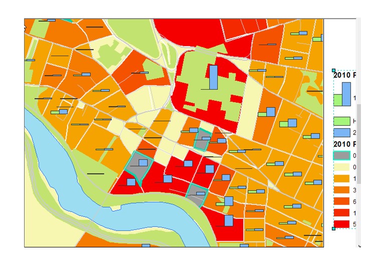
- Now use the Layer Properties for your Blocks layer and set up a Symbology > Quanitities > Graduated Colors renderer to provide an imppression of the phenomenon of People per Household according to the 2010 Census Block level data. Hint, I used 8 or 9 classes to show the general trends and some of the especially low, high and special cases, including those blocks where the block's attributes indicate at least one person, but no houses.
This new choropleth map of Persons Per Household in interesting but raises more questions than it answers. It seems clear that there are many people that the census recorded as being present in blocks, but who are not associated with "households". At this point it seems clear that maybe there are places where people may be staying that are not counted as part of Housing10.... There are some blocks where the number of Pop10 per Housing10 exceeds 100. The question of what the actual thinkg or condition that is counted as a unit of Housing10 is a question that has to be be investigated! We might learn something by looking at the Census metadata. We may also be able to explore this by finding extreme cases in the table and zooming in to them on the map.
We can also learn a lot about this mysterious phenomenon by shading the blocks using a color ramp and distinct colors for special values. reveal a part of the story. It takes a lot of tweaking to figure out the right breaks.
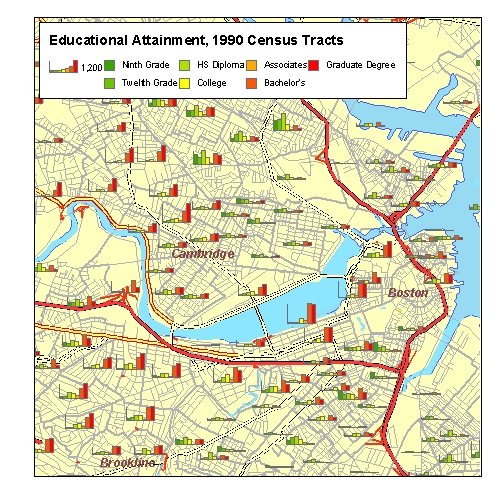
Creating a Bar-Chart Map to Portray Raw Quantities
It is difficult to get a good picture of the phenomenon of No-House Pops and Mega-Pop Houses by categorizing the blocks according to their values of Pop_Hse. It would help if we could have a map that showed the actual quantities of Housing10 and Pop10 in proportion to eachother. This could be very helpful.
The page about Mapping with Quantitative Data has a deeper discussion of this. But in a nutshell, If we want to help people visualize and compare measures of raw quantity, it is vry helpfulto signify the quantities with symbols that scale in a single dimension. Like Bar Charts.
References
Bar Charts are fun, and fairly straight-forward. The ArcMap INterface for fooling around with them has a few hidden features that are difficult to figure out. These wil be explained in swquence of screen-shots, below.
Don't Normalize the Size of Proprtional Symbols
Whether we intend it or not, users will instinctively associate the size of chart elements as comparable with size, magnitude or weight of the measures that are represented. Therefore normalizing the heights of the bars or the diameters of pie charts is going to confuse almost everyone. The people who aren;t confused will know that the map-maker is confused.
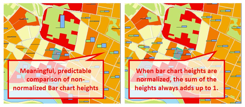
It is very easy to get confused when comparing areas based on normalized statistics. For example, An area with a very large percentage of unemployed people or a large number of Persons per Household are just as likely as not to be areas where the actual non-normaliozed count of people is very small. Bar charts are an effective means to help people to understand proportion and quantity at the same time.
